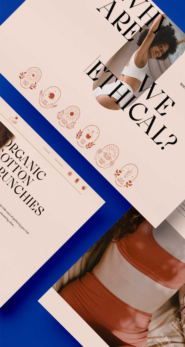
We designed an editorial-style ecommerce that responds to the strong personality of the brand.
We wanted the photographs to be the protagonists, so we chose a highly contrasting background to enhance the visual language created by Mònica Bedmar, the photographer. A texture and tone that speak the language of analog.
The subtle details in the navigation, such as the animation in the menu isotype and custom grid icons for the cart, account or search, fill the navigation with nuances that make it very special.
The customer’s journey is designed to be fluid, clearly showing product variants, its care and suggesting cross-selling options.
We’ve reduced the purchase friction at the most sensitive points, offering all the information related to sizes or shipping and return management without the user being forced to leave the product page.
In addition, opinions and information related to brand values are visible at all times to add value to the purchase.


 Translated with Linguana